Accessibility: the four checks to run by hand before any tool
An automated check finds absences; a human judges presences. Contrast, keyboard, forms, reading order: the four checks that need no tooling at all, and what they leave behind them.
The NessFlow team (Product engineering, NessFlow) · · 4 min read
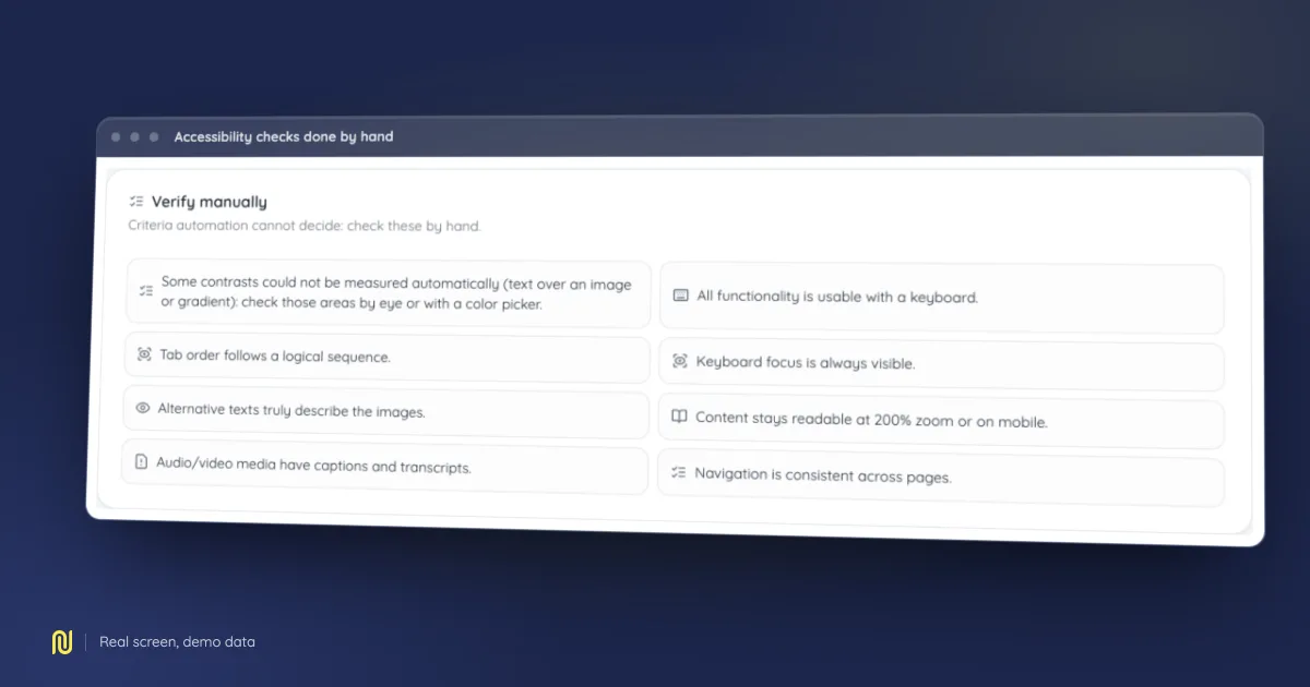
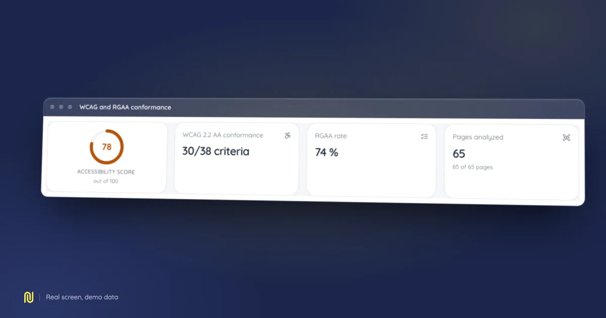
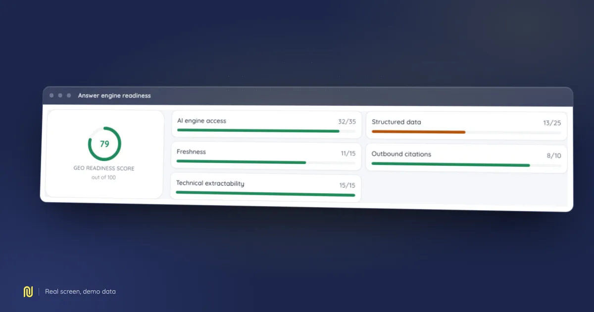
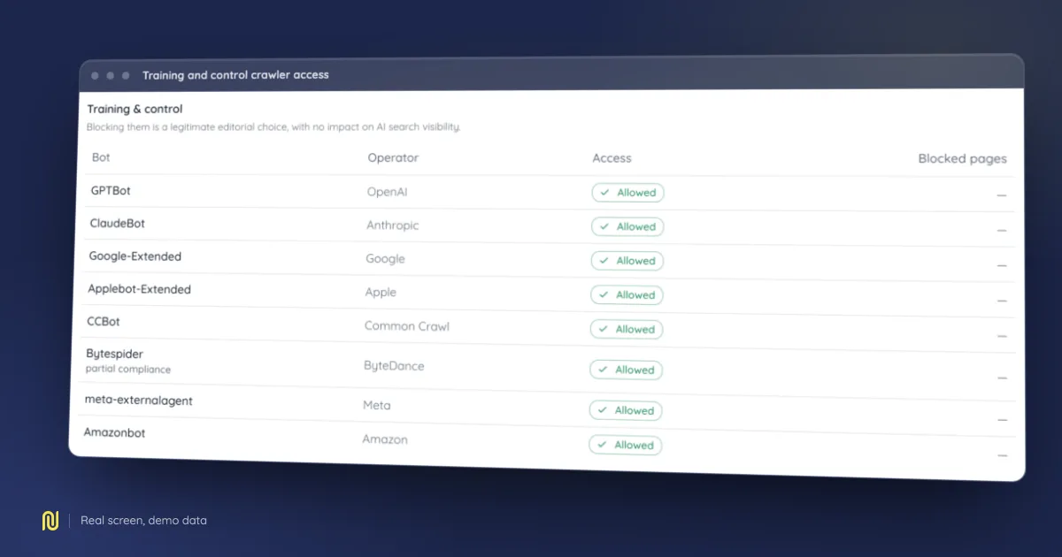
A real product screen, rendered on a fictional demo dataset: the figures shown belong to no client.
An automated accessibility check returns a list of errors in seconds, and that list is useful. It is also partial by construction: a large share of the criteria requires looking at what the page does, not at what it declares. Here are the four checks that need no tooling, in the order in which they find the most.
What a tool settles on its own, and what it does not
A tool can tell you an image has no alt attribute. It cannot tell you whether the alternative text describes the image: "photo" and "chart" both pass. It can tell you a field has no associated label. It cannot tell you whether the label is understandable. It can measure a contrast ratio between two declared colours. It cannot measure the contrast of text laid over a photograph.
The working rule: a tool finds absences, a human judges presences. The four checks below are exactly where human judgement finds what no rule encodes.
1. Contrast
The contrast ratio is a number between 1 and 21. The reference thresholds are 4.5:1 for body text and 3:1 for large text or for an interface element that carries information.
Two traps come up again and again, and neither is readable in a stylesheet.
Text over an image. The ratio depends on the pixel sitting behind each letter. A white heading over a photograph passes on the sky and fails on the building, inside the same sentence. The check: look at the lightest area of the image under the lightest run of text.
Opacity. A half-transparent colour is not the declared colour: it is its blend with the background. A grey signed off as compliant stops being compliant the moment it is laid down semi-transparent, while the value written in the code still reads as before. The check runs on the composited colour, as actually painted.
⚠️ And it does not only cover text: the border of a form field, a lone icon that carries meaning, and the focus ring all sit under the same threshold.
2. The keyboard
Put the mouse away and walk the page with the tab key. Three questions, in this order.
Can I reach everything? Every actionable control must be reachable. The classic defect is the div turned into a button by a click listener: it works with a mouse, it does not exist for a keyboard.
Can I see where I am? The focus ring must stay visible on every surface, dark ones included. The outline: none line written for aesthetic reasons is probably the most widespread accessibility regression on the web.
Can I get back out? A menu, a modal dialogue, a video player: if the tab key goes in and never comes out, a keyboard user is stuck on that page for good.
3. Forms
This is the surface where a defect costs the most, because it blocks a transaction rather than a read.
A label is not in-field helper text. Helper text disappears at the first keystroke, is not always announced by assistive technology, and its contrast is almost always too low. Every field carries an associated label, and a visible one.
An error message must say what to do. "Invalid field" is not a message; "the postcode expects five digits" is one. It must be tied to the field, not merely displayed beside it in red: colour alone carries no information for someone who does not distinguish it.
A required field is signalled by something other than colour. The asterisk has the merit of being a known convention: provided it is explained once, at the top of the form.
4. Reading order
This is the check almost nobody runs, and the one that finds the deepest defects: they come from structure, not from a forgotten attribute.
A page has two orders, the document's and the one the layout draws. Modern grids let you separate them entirely: a column declared first in the code can appear last on screen, and the other way round. A screen reader follows the document; a sighted reader follows the screen.
The check takes two gestures. Disable the styles and read the page as it comes out: the order must still make sense. Narrow the window until the layout collapses to a single column: the resulting order is the document's, and it is the best free preview of what assistive technology hears.
While you are there, check the heading hierarchy: one top-level heading, no skipped level, and titles that genuinely describe their section. Heading navigation is the first way a screen reader user moves through a page.
What is left after these four checks
A great deal, and it should be said: media alternatives, captions, motion, timing, consistency of navigation from page to page, clarity of language. These four checks do not make a site compliant: they remove a good share of the defects in an hour, with nothing installed, and they train the eye for the rest.
The rest gets measured and tracked over time. That is where a tool takes over: by running the same checks on every release, rather than once before an audit.